I'm going to take you on a journey about adding a gradient tint to a background image. The journey will go through text modifiers with regular and semibold font weights, and font colour. Using an image from Unsplash. Adding a black tint, then transform it to a gradient using a colour array. If you get lost along the journey, the final result is available on GitHub.
Level: beginner
Previously I've looked into adding a tint overlay to a background image... see (gradient overlay). The gradient overlay article was written using UIKit. Now with SwiftUI around the corner... the process is even easier. So how to achieve the same result using SwiftUI?
This article will walk you through:
- Sourcing and setting up the background image;
- Adding text;
- Setting up the tint as a flat colour then adding a gradient
Assumptions - dangerous I know:
- You know how to create a SwiftUI project
- You can prepare an image for the iPhone and add to the asset directory.
Begin by using an existing SwiftUI project or create a new project.
New SwiftUI project
This article works from the premise that you know how to create a new SwiftUI project. If not, read through how to create a new SwiftUI project first.
Setting up the main view
Create a new SwiftUI file - for this project I named it MainView.
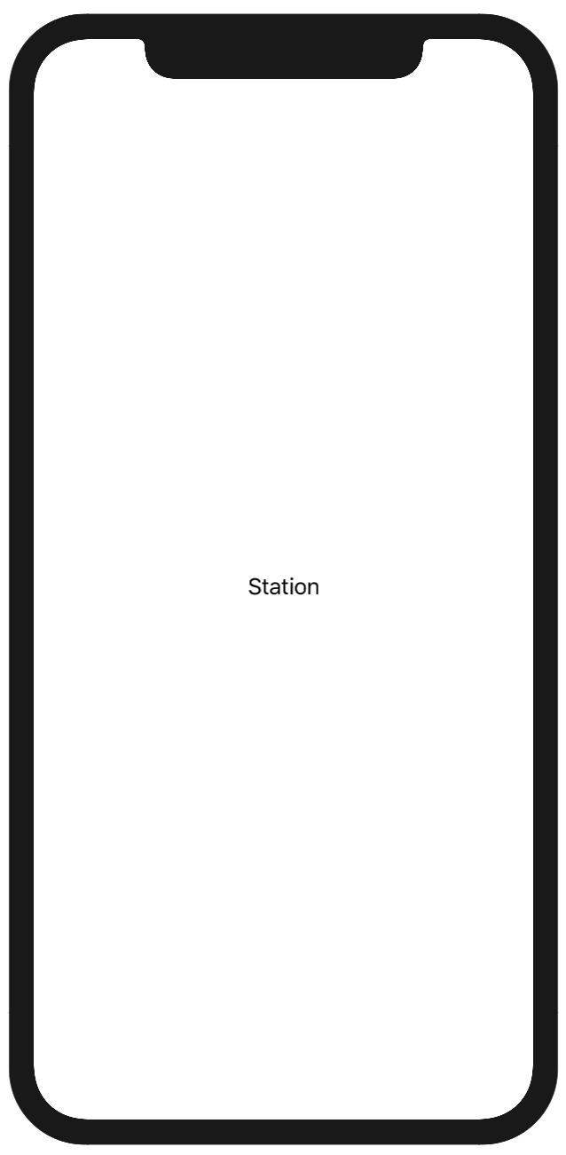
In MainView, begin by setting up the ZStack with the word station as text.
struct mainView: View {
  var body: some View {
     ZStack {
        VStack() {
          Text("Station")
        }
     }
  }
}
Check the output is showing station, you will need to change the ContentView file to the following
var body: some View {
  MainView()
}
|
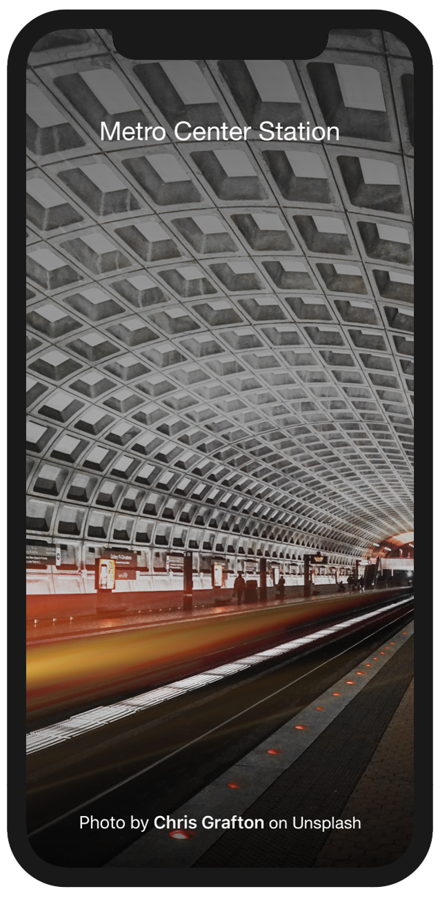
In the above code you have redirected what the content view will first show. The initial display was Hello World and now is Station. Where Station is managed from the MainView file. Go back to the MainView file and view the preview screen. Check that your display is the same as what is shown to the right. |
 |
Adding an image
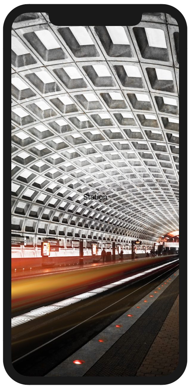
Using Unsplash, I downloaded a great photo by Chris Grafton taken of Washington DC Metro station. Download the file and format for the iPhone. You can check the screen sizes on the Apple developer site. Then add it to your assets. I named my files bgkMain.
Add image code just beneath the ZStack and before the VStack containing the text.
struct mainView: View {
  var body: some View {
    GeometryReader { geometry in
      ZStack {
        Image("bgkMain")
          .resizable()
          .aspectRatio(geometry.size, contentMode: .fill)
          .edgesIgnoringSafeArea(.all)
        VStack() {
          Text("Station")
        }
      }
    }
  }
}
In SwiftUI, images can be resized in different ways. By default, image views automatically sizes itself to their contents... however, note this may make the image go beyond the screen size. If you add the resizable() modifier then the image will be automatically sized so that it fills all the available space. In turn, by adding the resizable modifier the image goes as far as the safe area. Yet we don't want this to occur. So add .edgesIgnoringSafeArea(.all) modifier so the image runs to the edge of your screen. However, there might be another issue - being that the image has had its original aspect ratio distorted, because it will be stretched in all dimensions by whatever amount is needed to make it fill the space. If you want to keep its aspect ratio you should add an aspectRatio modifier using either .fill or .fit in the modifier .aspectRatio(geometry.size, contentMode: .fill).
|
Now you see the impact of adding an image to your background. However, your text has disappeared in to the ceiling of the train station. Whilst we won't immediately correct that issue, as first I will add a tint to the background image. |
 |
Setting up the tint view
In the extension directory, if you don't already have a file titled OverlayExtension then add one or in a file that makes sense to the functionality that we are about to add.
In this file add the following code:
struct TintOverlay: View {
  var body: some View {
    ZStack {
      Text(" ")
    }
    .frame(minWidth: 0, maxWidth: .infinity, minHeight: 0, maxHeight: .infinity)
    .background(Color.black)
  }
}
As you can see, the tint begins with a ZStack. That contains a frame from zero to infinity for the minimum and maximum widths and heights respectively. So you can see the immediate impact the colour has been set to black.
Applying the tint overlay to the MainView image. Add the following line of code to the MainView Image("bgkMain")
.overlay(TintOverlay().opacity(0.75))
So the adjusted image code changes to
Image("bkgMain")
    .resizable()
    .aspectRatio(geometry.size, contentMode: .fill)
    .overlay(TintOverlay().opacity(0.75))
    .edgesIgnoringSafeArea(.all)
The tint has an opacity of 75% or 0.75.
Let's go back and work on the text so it will be legible.
Cleaning up the text
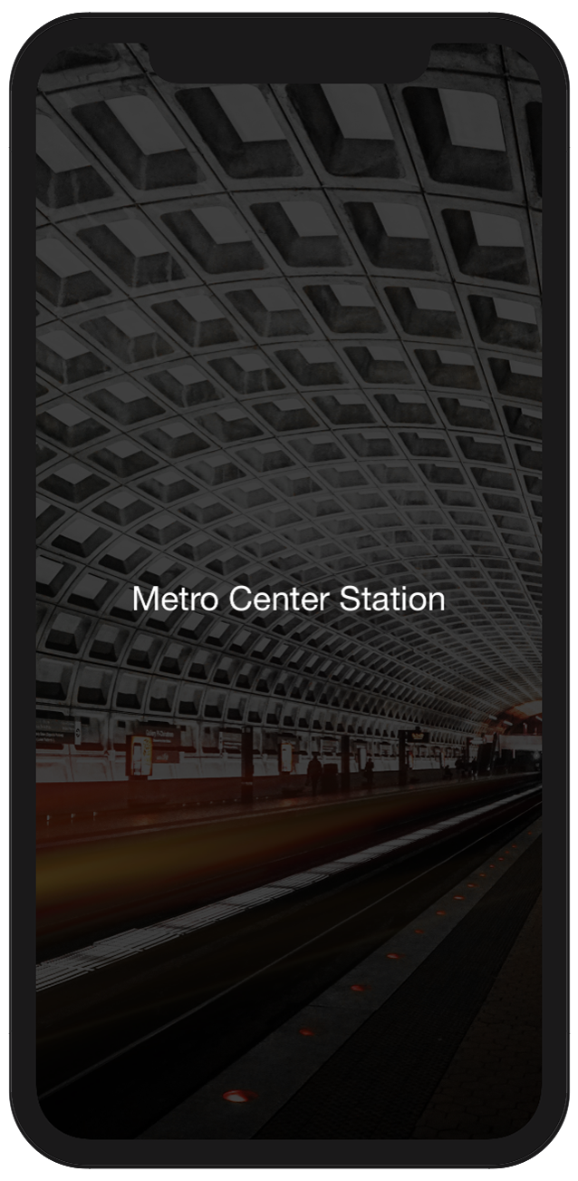
Change the text so it reflective of the name of the station. By changing Station to Metro Center Station.
Text("Metro Center Station")To contrast the colour with white by adding the following .foregroundColor(Color.white), so the text code will appear as:
Text("Metro Center Station")
    .foregroundColor(Color.white)
While adjusting the colour, let's change the font and size for better clarity. Add the code shown below beneath the foreground code.
.font(.custom("Helvetica Neue", size: 25.0))
|
In the above code you have redirected what the content view will first show. Go back to the MainView file and view the preview screen. Check that your display is the same as what is shown to the right. |
 |
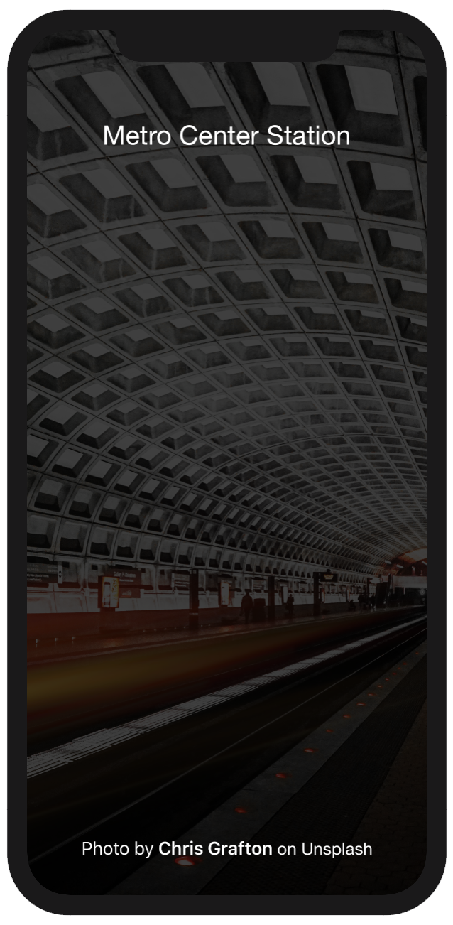
Let's add another text modifier giving recognition to the photographer... Photo by Chris Grafton on Unsplash. Add the following code below the Metro Center Station text
Text("Photo by Chris Grafton on Unsplash")
    .fontWeight(.regular)
    .foregroundColor(Color.white)
Okay good start, however, that is a little boring. Too vanilla. We can add weight to the photographer Chris Grafton, through making the font semibold and leaving the balance as regular.
To achieve this outcome, the text needs to be sliced so the different areas of text can be weighted.
Text("Photo by")
    .fontWeight(.regular)
    .foregroundColor(Color.white) +
Text(" Chris Grafton")
    .fontWeight(.semibold)
    .foregroundColor(Color.white) +
Text(" on Unsplash")
    .fontWeight(.regular)
    .font(.custom("Helvetica Neue", size: 16.0))
    .foregroundColor(Color.white)
Looking better. Maybe a little too close together. To correct the closeness, add padding. I will only add padding to the top and bottom. Add this following code to Metro Center Station text modifier.
.padding([.top, .bottom], 40)
The Metro Center Station text modifier will now be:
Text("Metro Center Station")
    .font(.custom("Helvetica Neue", size: 25.0))
    .foregroundColor(Color.white)
    .padding([.top, .bottom], 40)
If you want to show the text that has been added to towards the top and bottom of the screen - add a spacer.
Spacer()
This is to be added between the two text modifiers for Metro Center Station and Photo by Chris Grafton on Unsplash.
|
The text is split to the top for the Metro station in Washington DC and bottom for the photographer - Chris Grafton. Time to add the gradient to the tint. |
 |
Adding the gradient to the tint overlay
The SwiftUI framework comes with several built-in gradient effect. The code that will be applied generates a linear gradient from top (.top) to bottom (.bottom).
The set-up. Begin this section, by creating a new file in the extensions directory labelled ColorExtension. In this file add the following code
import SwiftUI
extension Color {
  static var gradient: Array<Color> {
    return [
      Color(red: 37/255, green: 37/255, blue: 37/255, opacity: 1.0),
      Color(red: 37/255, green: 37/255, blue: 37/255, opacity: 0.7),
      Color(red: 37/255, green: 37/255, blue: 37/255, opacity: 0.5),
      Color(red: 37/255, green: 37/255, blue: 37/255, opacity: 0.2),
      Color(red: 5/255, green: 5/255, blue: 5/255, opacity: 1.0)
    ]
  }
}
In the code above, it has been set-up as an array so you can add as many colours to the gradient as required.
To apply the gradient to the tint, a change needs to be made to the TintOverlay that was created earlier. Change the line
.background(Color.black)
to
.background(
      LinearGradient(gradient: Gradient(colors: Color.gradient), startPoint: .top, endPoint: .bottom)
        .edgesIgnoringSafeArea(.all)
    )
Boom and you are done.
|
Looking good. |
 |
If you want to download the complete Xcode file, you can at GitHub.